The Formal Club
The Formal Club
Brand redesign for a menswear label repositioning around sustainability
Brand redesign for a menswear label repositioning around sustainability
The Formal Club (TFC) is a men's formalwear brand best known for premium cotton shirts. I led a brand redesign to reposition it around eco-friendly materials and craftsmanship, moving the identity away from generic luxury signaling and toward a warmer, nature-led aesthetic that speaks directly to a slightly older, more established male customer.
The redesign spans a new typography and color system, a sustainability-first iconography set, a new sub-brand ("The Essentials") for accessories and layering pieces, and an updated product page experience that keeps the brand's premium positioning while foregrounding its material story.
The Formal Club (TFC) is a men's formalwear brand best known for premium cotton shirts. I led a brand redesign to reposition it around eco-friendly materials and craftsmanship, moving the identity away from generic luxury signaling and toward a warmer, nature-led aesthetic that speaks directly to a slightly older, more established male customer.
The redesign spans a new typography and color system, a sustainability-first iconography set, a new sub-brand ("The Essentials") for accessories and layering pieces, and an updated product page experience that keeps the brand's premium positioning while foregrounding its material story.
BRAND IDENTITY
BRAND IDENTITY
—
MENSWEAR
MENSWEAR
—
SUSTAINABLE FASHION
SUSTAINABLE FASHION
—
E-COMMERCE UX
E-COMMERCE UX
—
REDESIGN
REDESIGN
—
VISUAL IDENTITY
VISUAL IDENTITY
COMPANY
COMPANY
The Formal Club
The Formal Club
MY ROLE
MY ROLE
Brand & Product Designer.
Full ownership of the visual identity redesign, typography and color system, iconography, sub-brand development, and the redesigned product page experience.
Brand & Product Designer.
Full ownership of the visual identity redesign, typography and color system, iconography, sub-brand development, and the redesigned product page experience.
DURATION
DURATION
November 2025 - December 2025(1 month)
TOOLS
TOOLS
OVERVIEW
OVERVIEW
The Formal Club's original identity read as generic luxury menswear: gold accents, dark green, badges, and points programs, the same visual language most premium formalwear brands reach for by default. The client's brief was specific: reposition the brand around eco-friendly materials, without losing the premium feel their existing customer expected. I led a full identity redesign, typography, color, iconography, and messaging, built around a sustainability story, and carried that identity through to a redesigned product page.
The Formal Club's original identity read as generic luxury menswear: gold accents, dark green, badges, and points programs, the same visual language most premium formalwear brands reach for by default. The client's brief was specific: reposition the brand around eco-friendly materials, without losing the premium feel their existing customer expected. I led a full identity redesign, typography, color, iconography, and messaging, built around a sustainability story, and carried that identity through to a redesigned product page.

THE PRODUCT CONTEXT
THE PRODUCT CONTEXT
TFC's existing identity didn't say anything distinct. Gold-on-dark-green, loyalty points, and festival gifting banners are the default playbook for premium Indian menswear e-commerce, effective at signaling "quality," but interchangeable with most competitors in the category. The client wanted to use eco-friendly materials as their core differentiator going forward, and needed a brand identity that could actually carry that story rather than bury it under generic luxury cues.
The timing lines up with a broader shift in the category: sustainability has moved from a niche claim to a baseline expectation across fashion, and the menswear segment specifically is seeing brands lean into eco-conscious, minimalist positioning as men become more deliberate about durability and material sourcing in what they buy. The opportunity for TFC was to get there with a distinct point of view, a warm, natural, and slightly more mature identity, rather than the youth-skewing, stripped-back minimalism most "sustainable" fashion brands default to.
The target customer also mattered to every decision: men from their mid-twenties into middle age, established enough to pay a premium for quality and increasingly attentive to what a garment is actually made of, not a younger, trend-driven shopper. The identity needed to feel considered and grounded rather than trendy.
TFC's existing identity didn't say anything distinct. Gold-on-dark-green, loyalty points, and festival gifting banners are the default playbook for premium Indian menswear e-commerce, effective at signaling "quality," but interchangeable with most competitors in the category. The client wanted to use eco-friendly materials as their core differentiator going forward, and needed a brand identity that could actually carry that story rather than bury it under generic luxury cues.
The timing lines up with a broader shift in the category: sustainability has moved from a niche claim to a baseline expectation across fashion, and the menswear segment specifically is seeing brands lean into eco-conscious, minimalist positioning as men become more deliberate about durability and material sourcing in what they buy. The opportunity for TFC was to get there with a distinct point of view, a warm, natural, and slightly more mature identity, rather than the youth-skewing, stripped-back minimalism most "sustainable" fashion brands default to.
The target customer also mattered to every decision: men from their mid-twenties into middle age, established enough to pay a premium for quality and increasingly attentive to what a garment is actually made of, not a younger, trend-driven shopper. The identity needed to feel considered and grounded rather than trendy.
KEY DECISIONS
KEY DECISIONS
Replace luxury signaling with material honesty.
Instead of gold accents and points programs doing the work of implying quality, the new identity leads with the materials themselves. Iconography built around cotton and hemp motifs, alongside recycling and nature symbols, is used deliberately throughout the site to keep the "what this is made of and why it matters" story visible rather than left to a footnote or a certifications page.
Instead of gold accents and points programs doing the work of implying quality, the new identity leads with the materials themselves. Iconography built around cotton and hemp motifs, alongside recycling and nature symbols, is used deliberately throughout the site to keep the "what this is made of and why it matters" story visible rather than left to a footnote or a certifications page.
Choose a typography system built for restraint, not trend.
Choose a typography system built for restraint, not trend.
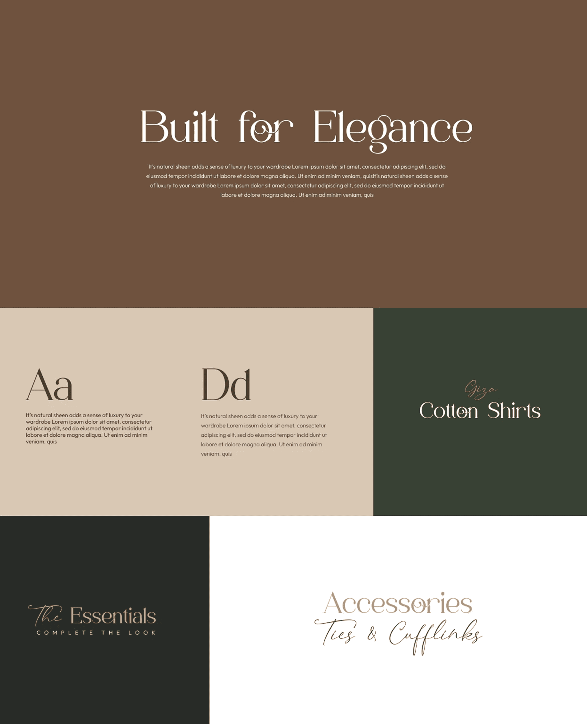
The new type system pairs a distinctive serif display face for headlines with a script for supporting accents and a clean sans for body copy and headings. The goal was a system that felt editorial and considered, the kind of typography that ages well and reads as established rather than chasing a seasonal fashion-brand look.
The new type system pairs a distinctive serif display face for headlines with a script for supporting accents and a clean sans for body copy and headings. The goal was a system that felt editorial and considered, the kind of typography that ages well and reads as established rather than chasing a seasonal fashion-brand look.
Shift the palette from gold-and-dark-green to warm, earthy neutrals.
Shift the palette from gold-and-dark-green to warm, earthy neutrals.
Deep olive, walnut brown, and cream replace the gold-and-black luxury palette. The new colors read as natural and grounded rather than ornamental, reinforcing the material story instead of competing with it, while still holding enough contrast and depth to feel premium.
Deep olive, walnut brown, and cream replace the gold-and-black luxury palette. The new colors read as natural and grounded rather than ornamental, reinforcing the material story instead of competing with it, while still holding enough contrast and depth to feel premium.

SCREENS DELIVERED
SCREENS DELIVERED
Typography & Color System: A three-typeface hierarchy (a distinctive serif for headlines, a script for supporting accents, a clean sans for body and headings) paired with a warm, earthy palette of olive, walnut brown, and cream, replacing the brand's original gold-and-dark-green luxury signaling.
Iconography Set: A custom icon system built around cotton and hemp motifs, alongside recycling, nature, and sustainability symbols, used throughout the site to keep the brand's material story visible rather than confined to a single page.
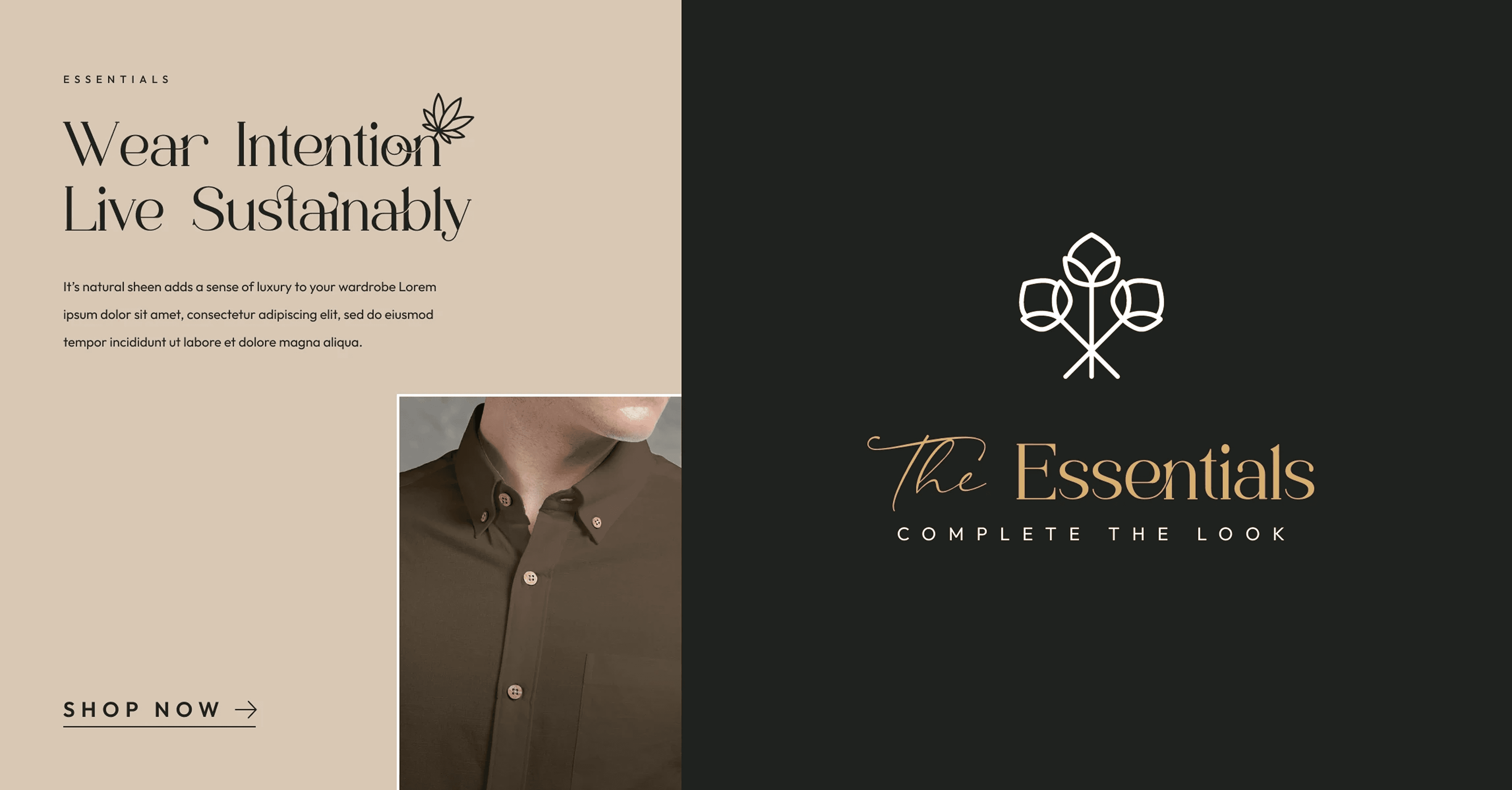
"The Essentials" Sub-Brand: A distinct wordmark and identity for accessories and layering pieces (ties, cufflinks, cotton shirt essentials), designed to feel like a curated extension of the main collection rather than a generic upsell category.
Brand Messaging & Key Visuals: Core campaign messaging ("Wear Intention. Live Sustainably.") applied across hero banners and marketing modules in both light and dark treatments, consistently pairing the new typography, iconography, and palette.
Redesigned Product Page: An updated PDP carrying the new identity through to the point of purchase, replacing generic trust badges with specific, checkable claims (zero polyester, lab tested, breathable design) and applying the new color and type system to bundle offers, reviews, and cross-sell modules.
Typography & Color System: A three-typeface hierarchy (a distinctive serif for headlines, a script for supporting accents, a clean sans for body and headings) paired with a warm, earthy palette of olive, walnut brown, and cream, replacing the brand's original gold-and-dark-green luxury signaling.
Iconography Set: A custom icon system built around cotton and hemp motifs, alongside recycling, nature, and sustainability symbols, used throughout the site to keep the brand's material story visible rather than confined to a single page.
"The Essentials" Sub-Brand: A distinct wordmark and identity for accessories and layering pieces (ties, cufflinks, cotton shirt essentials), designed to feel like a curated extension of the main collection rather than a generic upsell category.
Brand Messaging & Key Visuals: Core campaign messaging ("Wear Intention. Live Sustainably.") applied across hero banners and marketing modules in both light and dark treatments, consistently pairing the new typography, iconography, and palette.
Redesigned Product Page: An updated PDP carrying the new identity through to the point of purchase, replacing generic trust badges with specific, checkable claims (zero polyester, lab tested, breathable design) and applying the new color and type system to bundle offers, reviews, and cross-sell modules.

The result is a brand identity that gives The Formal Club a distinct, ownable position in a category where most competitors look alike, and a foundation the brand can carry from marketing through to the product page without the message getting diluted along the way.
The result is a brand identity that gives The Formal Club a distinct, ownable position in a category where most competitors look alike, and a foundation the brand can carry from marketing through to the product page without the message getting diluted along the way.
Not sure what your product needs?
Let's figure it out together.
Book a free discovery call
Product strategy and design for funded startups.
rahuljohnsonwork@gmail.com
Behance
Begin
mindfullness.
© 2026 Rahul Johnson M. All rights reserved.
Privacy Policy